
Redesigning the Osmind Patient App
Osmind is a platform built for mental health providers specializing in treatments like TMS and ketamine therapy. While the clinical tools are powerful, the patient-facing mobile app had fallen behind.
Patients were left navigating a visually inconsistent and clunky interface during an already vulnerable time in their care journey.
This project focused on redesigning the patient app to be clearer, more trustworthy, and easier to use with implementing new features to help clinicians.
Field
Healthcare
My Role
Product Strategy
UI/UX Design
Prototyping
Mobile Design
Project Overview
The problem
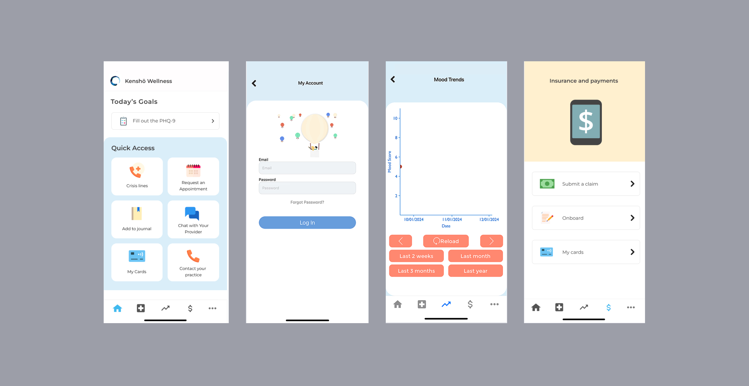
The original app lacked visual cohesion and information hierarchy. The overall aesthetic used mismatched colors and emoji-style illustrations that felt inconsistent with the clinical context patients were using it in. This was an opportunity to have the Osmind’s brand reflected in the app. Key workflows like capturing insurance information and filling out surveys were fragmented and lacked proper states. Clinicians expressed that patients had a difficult time using that app, which meant less data capturing and more work for clinicians.
Original app design
Goals
Give patients an immediate, useful overview of their care when they open the app
Redesign core workflows (appointments, billing, insurance, superbills) to be clear and complete
Establish a consistent visual language with proper component states for each app screen
Reduce cognitive load during tasks that are already stressful for patients
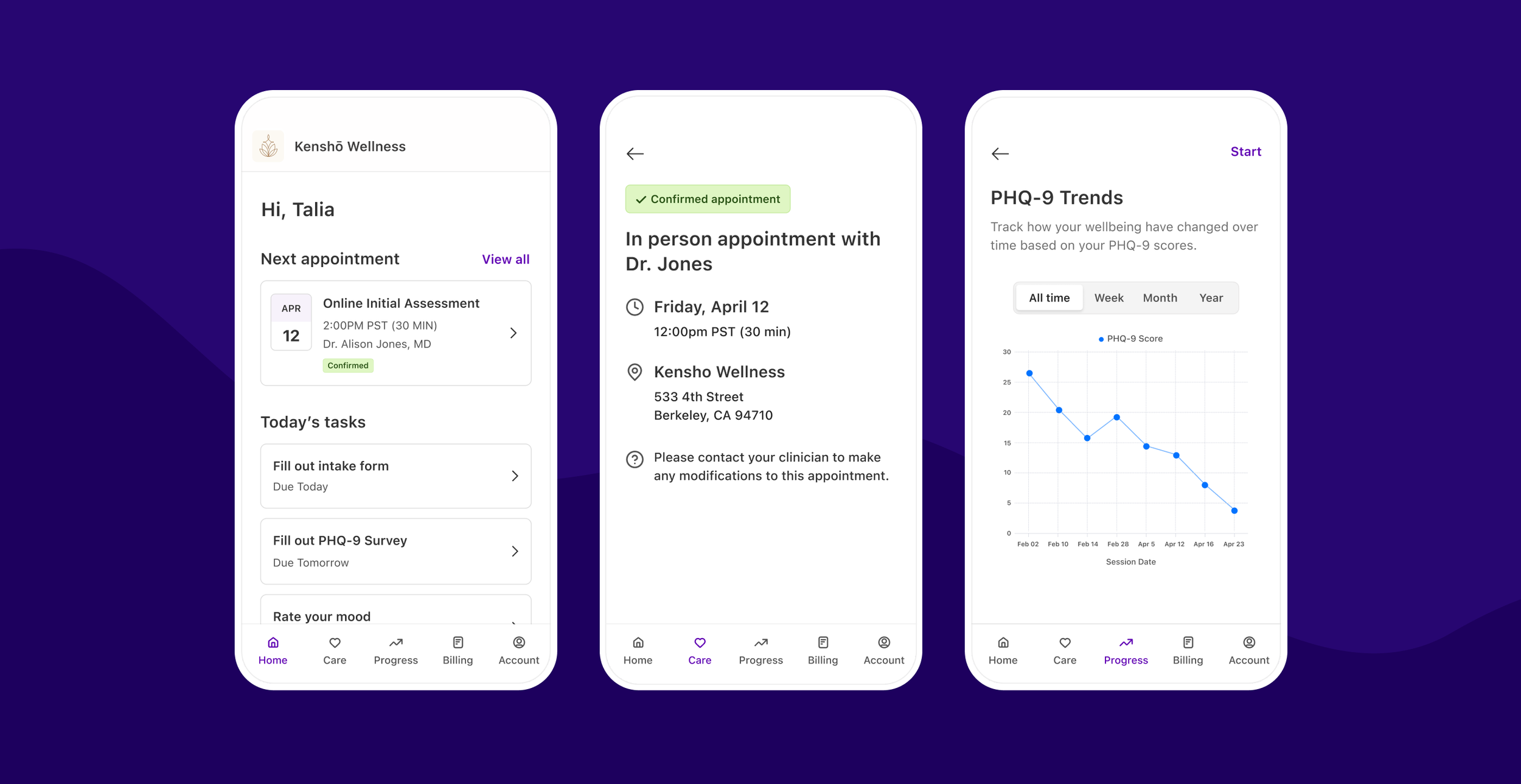
Final App Design
Cohesive design system
Applied Osmind's updated visual system with a clean white base, purple brand accents, and clear typographic hierarch with streamlined navigation. I transformed the home screen into an actionable dashboard showing appointment status, pending tasks, and one-tap access to key functions, reducing navigation friction.
Insurance capture
Transformed a complex insurance intake process with intelligent auto-complete, contextual dropdowns, and progress indicators across primary, secondary, and authorization sections, streamlining a traditionally cumbersome healthcare workflow.
Payment information
A complete card management system allowing clinics to process payments seamlessly using stored cards, removing the burden of payment follow-ups during critical patient care moments.
Appointments
Redesigned appointment request flow with intelligent auto-complete and contextual guidance. Patients now manage all appointments in one centralized view with real-time status updates, providing complete visibility into their care schedule.
Results
20x
Growth in weekly active scheduling practices within 6 months
50+
Clinics adopted in-app appointment scheduling
90
Appointment requests per week by early 2024, one month after launch
52%
Increase in monthly payment volume after card-on-file launch
Further Context
Appointments that work
Following the redesign, the appointment request feature, which was previously an email link to the clinic, was adopted by 50+ practices on the platform. Weekly active practices grew from just 2 to nearly 20 within six months of launch, with appointment requests climbing to approximately 90 per week by early 2024. The redesign gave both patients and clinics a structured, trackable way to manage appointments for the first time.
52% increase in payment volume
The feature launched in October 2023 and coincided with notable platform growth. Total monthly payment volume climbed from ~$42k to over $64k in the following months, with the number of clinics actively processing payments growing from ~140 to nearly 190. Giving patients a clearer, more trustworthy way to add a card on file is believed to have contributed to this increase in payment adoption.